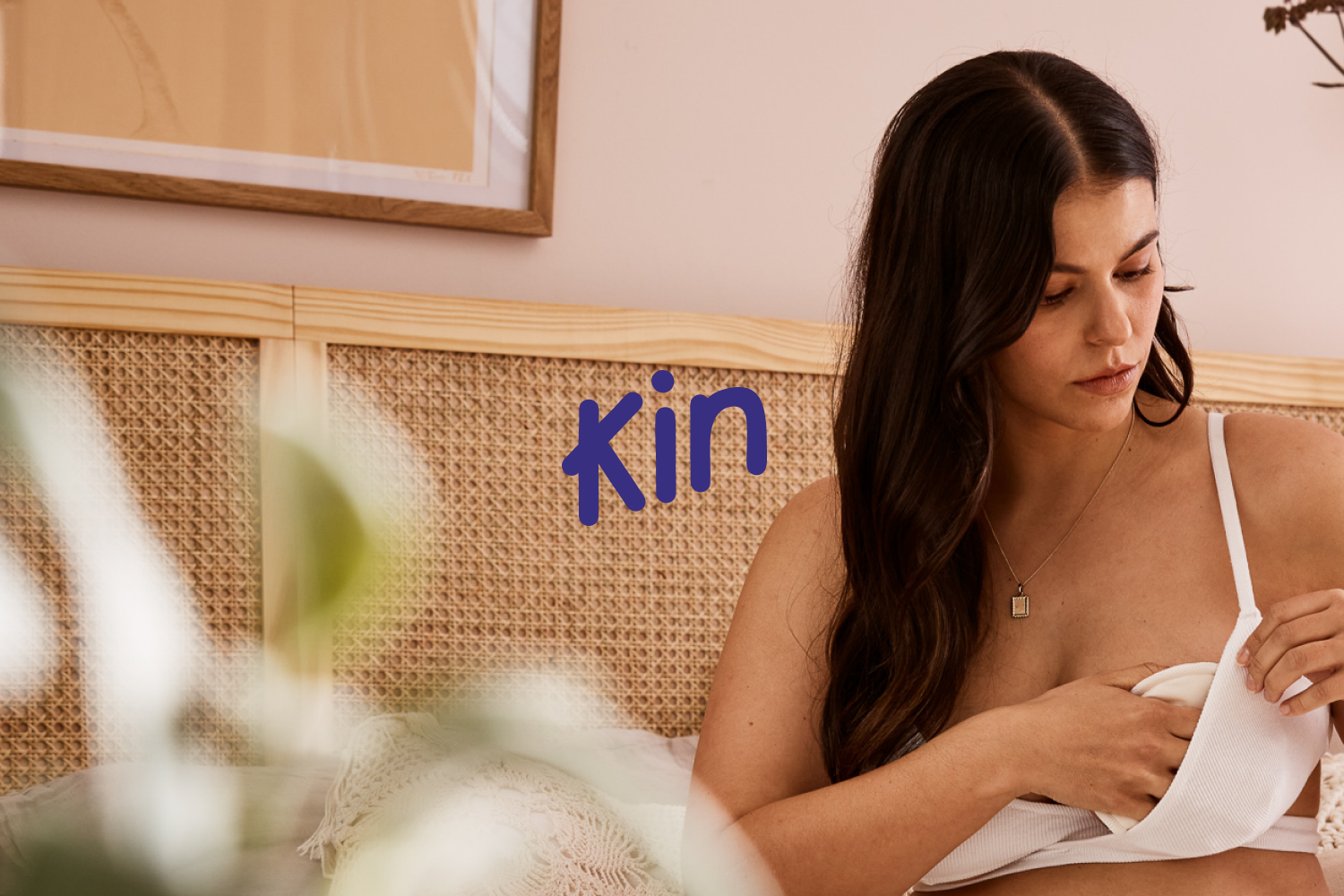


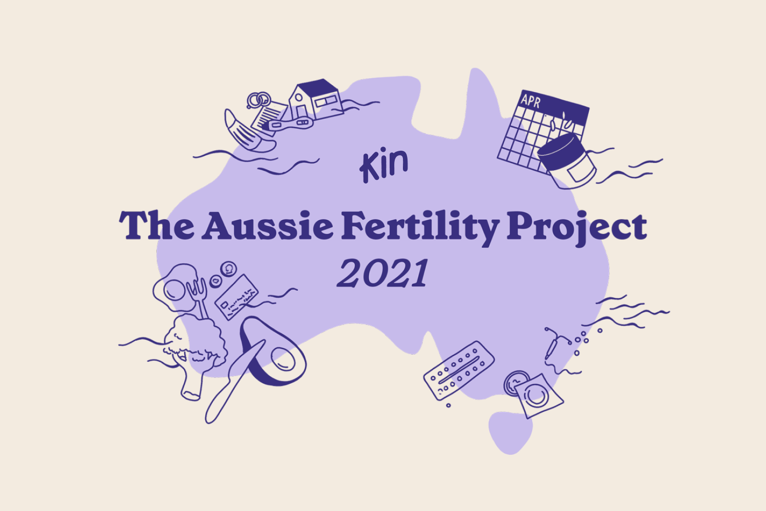


Kin is Australia’s most comprehensive reproductive healthcare service for people with ovaries. They empower people to take control of their fertility journey through professional consultation, products and support, from contraception to postpartum.
The brand idea, on our terms, runs strong through the voice and identity. There is a sense of honesty, warmth and approachability that sets Kin apart from other traditionally sterile reproductive health services on offer to Australians. Kin supports women through the five stages of the fertility journey – one that is unique to the individual. The identity maps the varied stages of maturity through a colour + icon system and is grounded by the core brand elements.
Brand refresh | Art Direction | Packaging | UI Design | Graphic Design
Team: Eucalyptus
Lifestyle photography: Cara O’Dowd
Stylist: Courtney Humphrey